Sunday, 30 March 2014

Question 2 Evaluation


“How effective is the combination of your main product and ancillary text?”


In the brief that has been given for our A2 Media studies we had to come up with a product and an ancillary text that fitted in with the codes and conventions of our chosen genre. Furthermore we also had to try and challenge these but with purpose and meaning. Throughout the Digi-pak, advert and music video we had to make sure they all linked and you could tell that all product and ancillary text belonged together.

The genre for our chosen song is “Folk/Acoustic”. The song that Erica Hall and myself picked together was “Drew Tabor – Silver Lights”. It’s a very happy, bubbly song which makes you smile and laugh. This is something that we thought was a good emotion to bring across into our product and ancillary texts. What Erica Hall and myself wanted to combine within our media texts would be the whole codes and conventions and making it as effective as it can be by using synergy throughout the main product and the ancillary texts. We felt in order to make our Digi-Pak, Advert and Music Video link well would be by having similarities between the whole lot of them. This is because we believe that it keeps a constant flow throughout our work and is effective for audiences buying them.


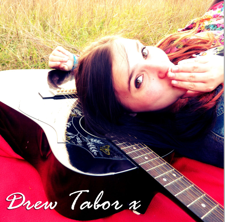
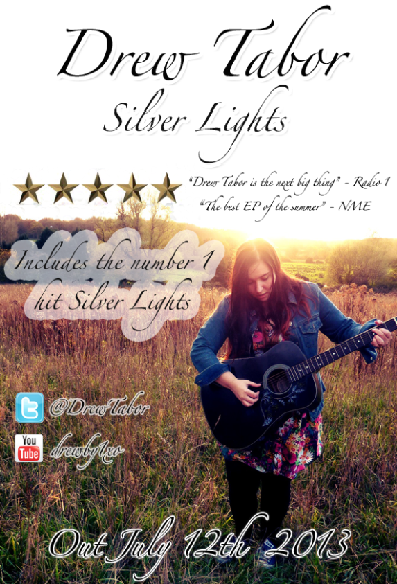
Taking a look at our ancillary texts. This is our Digi-pak and our advert.  As you can see there is synergy from both of the ancillary texts. For instance the location, the costume and the natural nature aspects. Furthermore you can see that there is synergy used throughout due to the use of the same font. We decided to keep the font the same because it’s almost like the style we would see the artist use whenever they have posters or an album out. There’s a certain colour theme between each of these ancillary text which links well together. This is effective because it’s keeping that synergy flowing throughout our work. The colour's being very natural and earthy tones for instance – golden, browns, greens and then of course the outfit colour's. The earthy tones from each ancillary texts help connect with the genre of folk. And then when you get to the costume colour's it helps relate back with the happy upbeat atmosphere. I believe that this is very effective for our target audiences because the outfit choice I have chosen to wear is very bold and eye catching. It’s bright which relates to that upbeat atmosphere of summer, because this is a very eye catching, bright costume choice and its bold. It stands out well in the music video. For instance if a fan were to buy this digi-pak or saw this advert they would immediately catch on because the dress and the guitar are so iconic.


Going into the use of musical instruments we had to use the acoustic guitar. This was because it related well with the folk/acoustic genre. The guitar is one of our symbolic uses throughout the whole inter music video. However because the acoustic guitar has been used so often within our ancillary texts it helps relate that genre style of music back to folk/acoustic. This is a good thing because its straight away telling an audience that this genre will be of folk and acoustic music. Not only is that due to the use of guitar but it’s been shown through the use of setting to. It’s very natural and golden which creates that summer feeling and folkish style setting. Straight away from the bottom right panel you can see the stereotypical shot of the artist lying on a blanket in a field with the acoustic. Just by this shot you can see that Goodwin’s theory comes in, the star image and then of course the codes and conventions of folk/acoustic. This is consistent throughout our music video and throughout the ancillary texts.

 The combination of our ancillary text and our main product is very effective. We kept things similar throughout making sure that myself and Erica stuck to the same codes and conventions of our chosen genre. Something that works very well with our main product and ancillary text would be the way everything links to make a professional slick statement. For instance the colour's are similar. The outfits and location are the same. This is good because if one of our target audience members were to look at our ancillary texts they would be able to recognize who it is and what music video it’s from because we have used synergy to keep that professional flow throughout our work.

This field is symbolic for our location it has been used throughout each part of our coursework. For instance The music video, the advert and the digi-pak. This fits in with the codes and conventions of folk genre.

When you look back at our main product and ancillary texts you can see how each one actually fits the codes and conventions of your chosen genre. For instance the them of acoustic – there needs to be that symbolic use of the guitar throughout the music video, However to get the correct target audience to watch this is going to need to be shown through the advert and digi-pak too. This is exactly what myself and Erica decided on. We decided to make sure that the symbolic guitar was a main theme throughout our work so it related to the codes and conventions of folk/acoustic music. 

Something that’s important when making the main product and the ancillary text effective would be the use of “Goodwins Theory” – Making sure we applied the use of star image. This is used throughout all the ancillary texts, and music video. Almost every shot within our music video uses the star image. For instance if we take the first shot we are shown the acoustic guitar and myself playing it (shown above) – This is the use of star image. The audience are completely focused on the
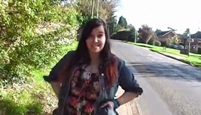
singer playing the guitar. Also the position of this girl how she is central for the whole frame, its effective because it stands out for the audience because that is their immediate focal point. Furthermore throughout the use of our music video you can clearly see that the star image has been used in each verse, chorus and bridge. The star image is always the focal point. This is something which is repeated throughout our music video and came across very strongly. The fact the singer looks to the camera and sings it involves the audience because it make it seems like she is singing to the audience which could make fans of the song take a  more likeable character to the song chosen. In this image you can clearly see that Star image is used again – The blocking of our filming is something we focused on strongly and the different camera angles. For instance myself walking down the street centre camera on a long shot. Its effective because shes alone and the immediate focus is the girl.
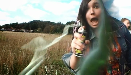
Something which makes our music video effective would be the vibes that we give throughout the whole video. The themes and vibes are what I and Erica worked on a lot. We did this by the use of characterization In a lot of our shots that we have used Goodwin’s Theory has been applied to each part. This is something myself and Erica made sure of when we were filming our music video. In this frame you can see myself using the prop of “Silly String” this is great because it emphasizes on the crazy and fun atmosphere of our music video. It’s also symbolic because you can relate it to being summer and partying – Silly String is used at many party’s and used for celebrating or just having silly string fights with. This is symbolic because a lot of friends use this at parties and just go crazy and have fun with it. In the chorus scenes we wanted them to be as symbolic as possible. When rehearsing these we just tried to be as over the top as we could and have fun with it. Showing facial expressions and just crazy friendships. Silly stuff that your casual friends would do in those times. This is something that me and Erica focused on and we found it to be rather natural when doing it. Its effective because when you go to the Ancillary texts you can see a whole different side almost relaxing - Which fits in with the themes of summer again, Wanting to have fun and relax. I feel like our digi-pak and advert is rather calming and relaxing almost brings across this complete different message from the video itself which is good because it shows all the emotions that we wanted to bring across to the audience. 


I think overall our advert relates more to the style of the genre. We have made this, this way because the photos that were taken relate to that style of genre, and everything about this advert actually seems to link in with the chosen genre. Again star image is used because its synergy and used throughout all the other areas. If people were to look at this advert in a magazine or on a billboard people would immediately know that “This girl” is actually Drew Tabor.

We have tried to relate the colour's themes throughout the digi-pak and advert – The same fonts, text sizes, style. Even the colour of the golden stars. The way I have been placed by using the rule of 3 lines is great because in every image I have the focal point which screams out star image.

If we go back to the Digi-Pak you can see Goodwins theory has been applied again with the use of star image. Every panel has a picture of the singer except from 2 landscape shots of the place where we actually performed in. All costumes are the same, and the guitar is used throughout this too. The text is the same with the similar style of the bubbles around them.

On my blog I've posted about Digi-Pak analysis. This is something which also helped me and Erica plan our final outcome to a Digi-Pak. It was good because it taught us the kind of things we need to stay clear from or other things we needed to include to reach for the right target audience. 

Taking our music video, Digi-Pak and Ancillary texts into consideration you can clearly see that all these 3 products link together. With the use of synergy and Goodwin’s theory. Linking all 3 products together is very effective for us and the audience because it makes it easier for the audience to understand what goes together. The same star image has been used, the same fonts, texts, colours, rule of 3 and location this makes our overall product bold and eye-catching for the audience. It’s bold colour choice which will make the audience want to play and listen to it. The genre straight away is easy to read due to the symbolic use of the guitar and the location we have decided to use throughout the 3 products. Overall our music video and ancillary texts are effective for our target audiences and our chosen genre of music. It looks professional and bold and has synergy used all the way through. This keeps the consistency and constant flow throughout.

Thursday, 27 March 2014

Question 1 Evaluation

“In what ways does your media product use develop or challenge forms and conventions of real media products?”

To make a music video you have to consider the basic codes and conventions of a music video. These codes and conventions would be along the lines of Goodwin’s theory for instance such as; thought beats, Narrative and performance, the star image, relation of visuals to a song and Technical Aspects. To create the right music video we had to do a lot of research. This meant figuring out what kind of style of genre for the song "Silver Lights" by Drew Tabor was. This meant we had to kind of analyse the style which was mainly folk/acoustic. After researching into the different genres and styles we then had to research into the main focus points of the genre and see what kind of codes and conventions are involved to create the folk/acoustic genre music video. The reasons for researching into these codes and conventions were so that we could create the right style/symbolic video for the genre that different target audiences would understand.

Looking at the advert that we designed. You can't straight away see the use of rule of 3 by the photograph. When Erica Hall took these photographs we were constantly making sure there was the use of rule of 3 and that the images were as clear as we could get them and with great quality. Personally I think the photographs for our ancillary texts have all be strong. We carefully researched and thought into how we were going to portray the same conventions from the music video into the ancillary text to keep the professional feel and flow throughout our work. Using the rule of 3 helped us a lot because it gave us more room to add text and play around with the image a lot more. Stereotypically using the rule of three and lining up the picture with the lines on the grid when taking the photograph tend to make it more focal and eye catching for an audience too look at, this is one of the many reasons why we wanted to use the rule of three because for our kind of style of genre we needed it to look as eye catching as possible.


When researching into the advertisement we had to think of certain things that would make the audience think straight away and know that it was a folk/acoustic style genre. For example within our advertisement you can see myself holding a guitar straight away from this you can tell that it’s going to be an instrument/acoustic based genre. The setting we are located in is very natural, with the natural lighting from outdoors, for instance the fields, sun, trees and hills in the distance combine together to create the genre of folk. For instance when looking into the girl band
“Cimorelli” – (YouTube Artist) –


We noticed the use of sun in their surroundings and how much that effected the attitude towards the whole song/ EP altogether. This is something that influenced us a lot when taking the pictures because we wanted this happy upbeat energy brought through with the music video then continued throughout our ancillary texts. We made sure our location fitted in well with the folk genre of the song because we knew straight away the acoustic would be shown as an acoustic genre. Furthermore the use of lighting within our advertisement shows the conventions to an folk style genre music video. However decided to challenge these conventions. Folk style genre codes and conventions involve a lot of lighting and shadow play. We didn’t want to make the ancillary or music video to dark so instead we went for more of the brighter lights/sunrays and a little bit of shadow in different sections of the images we took – There is a pacific part within our music video where the use of shadows and lights is shown, I shall be commenting on this later on in this essay.


Linking in with the mise en scene you can see the outfit in am wearing is a dress, leggings. Converse and a denim jacket. We wanted the style of the outfit to bring out the happiness or bright atmosphere of the song Silver Lights. In the music video I am wearing the exact same outfit as I am in the Digi Pak and the Advert. This is because it has a good use of flow and is consistent throughout making it look professional. We wanted the outfit to link in with the certain codes and themes too. For instance for an acoustic style we challenged it and decided to go for brighter coloured outfits which bring the whole In your face or Eye catching look. Its bold and it screams out summer because of the floral patterns. The converse Im wearing can clearly relate to teenagers because thats something they would find appealing being a worldwide known brand. Its also recently becoming very big over in the UK to. The denim jacket Im wearing can be related back to the artist I have researched into for instance Eliza Doolittle, and then if youre thinking acoustic style based the band The Script” or something like "Tom Odell" the star image focal point is always seen wearing denim jackets which comes across as being Acoustic style. Going into my facial expressions are very silly and kind of fun which could appeal and make audiences smile and laugh because its not something you would see often on a Digi pak. Touching of the hair also adds to the femininity of the ancillary texts/music video. The use of colours within my dress theres a lot of pinks can also
relate that our target audiences is based around females. For example looking over to The Script album cover you can see that the lead singer is wearing a leather jacket  however in our costume choice we challenged this convention and went for a Denim Jacket to link well with the acoustic guitar and the whole surroundings and themes. Comparing "The Script" with "Tom Odell" - he also wears the denim jacket but has more of an urban surroundings. This is something we decided not take on however we liked how "The Script" were standing in fields to link in that "Boy Band" - "Folk/Acoustic" style music. What we wanted to do for our Digi-Pak would be to create the Folk/acoustic styles with touches of femininity on the way. Our overall Digi-Pak had the codes and conventions of Good-wins Theory, and then 

Things that we challenged when making the digi paks would be the different styles. For instance I did a lot of research into Eliza Doolittle because her style music is very similar to our kind of theme and it makes you smile. Its also very upbeat however looking at Eliza Doolittles album cover  It is very bright and it does look upbeat with a lot of energy. Its a very busy composition. When you come back to our ancillary texts, We didnt want it to be a buys composition. Also having that style of composition would not of fit in well with the whole Folk/Acoustic style genre. Eliza Doolittle's Work was something that inspired us a little however not so much with the ancillary texts, it inspired lots throughout the music video... However when we come to the ancillary text it was more of a way of "how are we going to make our target audience catch this?" "how will we know this suit our target audience" this is why we kind of left all of the details to be genre, colour themed and symbolic basic. That way teenagers picking up the Digi-pak would understand that its aimed at "folk/acoustic" lovers. Going back to Eliza Doolittle, her music videos and her characterization was something that influenced our work alot throughout the research and planning. I researched into videos of hers like "Big When I Was Little". Straight away from the first scene we are given an upbeat personality. This is something myself and Erica thought could work well, However we didn't want to film our video this way. 


What we noticed was that Eliza uses bold big colors which stand out and capture the eye. We noticed that she walks down the streets alot within her music videos which relates it back to this "Local, nature" aspects of our ancillary texts which links in with the actual music video. "Big When I Was Little" Really helped influence our work by the local settings, For instance once scene we see Eliza Doolittle as the star image using Goodwins Theory walking down a street, That's colorful and it almost feels summery. This influenced our work alot. We decided to take ideas like this and use them within our own music video. For instance you get a shot of me walking towards the camera - exactly like Eliza Doolittle does, in a natural setting of trees, roads and houses in the background. You can see from these two photos, and its surroundings how the codes and conventions of folk/acoustic/pop links in with Eliza's video... and also influences our video too. 


There were alot of these scenes within our music video which were similar, however we mainly used them for the verses. walking down the roads to create this nature, outdoors look which relates to that summer feeling. in our music video, Part of this which also influenced us would be the girl "Lenka" who sings "The Show". She influenced us to make the music video very quirky and cheesy. This is good because Lenka also had the same surroundings as us. Green areas and trees to create that natural nature aspect. In the first scene of Lenka's music video we see her seated on a park bench. Somewhere locally possibly. In our music video you see our first scene of myself sat against the sign that is posted. This is due to the fact that we liked how the camera angle would be from this part. Lenka's music video influenced us to start from sitting down. This is also due to the fact that the first verse isn't upbeat its rather cool and chilled which creates this smooth calm vibe. However the more you go into the song it gets up tempo. So we decided to start by sitting like Lenka did in her video. Also The fact that i'm sitting shows that its a more natural aspect towards the video which links in the codes and conventions of folk and acoustic. Also the lighting plays well with the genre of folk music because there are light beams throughout creating that summer sunshine feeling.


When we got to the chorus, we noticed alot of the time chorus numbers within music videos from research we had found out that they tend to be the most upbeat part of the music videos which makes it whole. The chorus in actual fact should be the part that is emphasized the most and creates the whole message overall. This is something that we wanted to do. We decided that we would keep the verses quirky and then build the chorus us to be fun and energetic which will create that happy upbeat atmosphere. To bring this across to the audience it would mean using the facial expressions and having the brightness of our costumes being big and bold. That's another influence. Eliza Doolittle uses alot of bright colours from alot of her music videos to create this happy atmosphere. We have done this by using the sun to create beams against the camera and glares and then we have decided to use the costumes as floral patterns which are bright and stand out against anything. Bright costumes link with the mis en scene of the teenage girl audience that we want to target our audience at. 


Going back to the advert that I and Erica Hall created you can clearly see that we researched a lot on how adverts should be presented. For instance we added in the twitter logo, YouTube logo. This is because from AS research last year we could clearly see that technology is something that teenagers use a lot of nowadays. This is why we decided to use the logos of YouTube and Twitter because of “Active Participants” or “Active Audiences” having that control of being able to speak freely with fans and letting them interact with the music video and the overall advert. It’s good because its advertising the user in a teenager style way which is why we choose this way of advertising overall because its simple, easy and fast. All teenagers have to do is search the twitter name and find them, follow them and then there’s a new fan. When you look at the normal adverts within magazines for perfume companies or film companies they usual add in their twitter names or Facebook pages this is why we decided to add in the YouTube artist – because the singer is an actual YouTube Artist that makes covers frequently.  Furthermore or target audience is aimed at teenagers this is great, because social networking sites normal aim for teenagers and up that’s exactly the kind of target audience we have gone for which means we are more likely to gather teenager audiences and create a bigger audience base because the use of distributing it onto these websites.

Our Digi-Pak is something that we wanted to make look as professional as we can. Ways we did this would be by keeping up the codes and conventions throughout the advert and the music video and bringing them too our Digi-Pak. Our Digi-Pak has a strict color theme and we made sure that it looked professional enough. From the start of the year myself and Erica Hall remembered the rule of 3 when taking photos for media, this is to create focal points for the audience. When looking into Digi-Paks we realized that Ellie Golding might be the best influence for us. We saw Eliza Doolittle Digi-pak and decided that It wouldn't work as a busy composition for our song that we have chosen. It would be best to make it as close to genre base as possible for the target audience benefit. We liked how Ellie Goulding's album has that use of an acoustic guitar, plus the Goodwins theory of star image used throughout. Also showing the guitar the location in one picture basically shows that its "Folk,Acoustic" style genre based. Exactly the same as ours.

This is Ellie Goulding's Digi-Pak for "The Writer" - we decided that this kind of style would be best for our Digi Pak. It has a suited color theme, that could be easily applied to the Advert. To keep that consistent flow throughout. However our Digi-Pak really did go with the codes and conventions. We challenged the colours with the costume choice because they were bold choices, however this did link really well with our chosen target audience being mainly aimed at teenage girls. We liked the way Ellie Gouldings Digi-Pak mainly focus on her and there's a picture of her with the guitar which says that she is a songwriter and comes up with alot of her songs acoustically. Knowing that the YouTube Artist We have choosen "Drew Tabor" is a pretty well known on YouTube it's good because it means we can use the acoustic guitar and be influenced by Ellie Goulding's Digi-Pak because Drew Tabor Is an artist on YouTube that Covers songs and writes songs too.
Codes and conventions of folk and acoustic music is usually rather dull. Thinking into artist of Ed Sheeran with "A Team" - His hole video is acoustic but his effect on his video is black and white which makes this depressing feeling. We challenged this throughout our music video by having it in a normal colour and not always using the acoustic guitar. when You're thinking folk they tend to say they focus alot more on close ups of their instruments. We have done this within our music video because we expressed the way how the artist "Drew Tabor" is an acoustic singer songwriter with a add of folk. We have made sure the guitar is a symbolic theme throughout all of our work being the Ancillary texts and also the music video.

Another part of Goodwin’s theory that we used would be the lyrics and visuals. This is something that we wanted to make stand out a lot throughout our video. In our research and planning stage we


decided to use white card and write the lyrics of “Oh Oh Oh” on them this. Its good because it’s bold and a quirky choice. This is good because whenever the chorus start we used the teansition of sliding doors effect. So it slides open onto this “Oh” cards which makes it stand out. Also the audience will be able to sing along to the lyrics when watching this part. Overall the song is rather catchy and when playing it to the audience they all started to sing the lyrics back which is great because it means that the song we had chosen and the lyric’s and visuals are working.

In The music video however we stuck with the codes and conventions of folk style music having close up shots of the guitar in some of the little instrumental parts.

The transition we used for this is effective because it opens and suddenly there is the card with the lyrics. It stands out, it’s a creative choice not a lot of music video for the genre of folk/acoustic pick this kind of thing to do so in some way you could say we challenged the codes and the conventions at this point. By  making a bold choice and making it effective for the audience watching.


Not only are lyrics and visuals important throughout our music video but the music and visuals are also important. At the beginning of the song we get a guitar picked chord which is bold and loud. In our music video we have applied this to a lot of the intro parts of the song where you can hear the guitar being played. Showing the guitar picking the strings of that chord is symbolic and makes it stand out.

Going back to the vibes of summer. We tried to show this by the different angles/lighting choices within our music video. Sometimes when we caught the sun right it showed through the reflection of the camera creating sun rays or beams. This is exactly what we wanted because when we were researching into different songs a lot of the upbeat happy emotions and vibes created that summer feeling by just certain camera angles. – On one of the verse we get given the lyrics of “It shines between the spaces of the trees and finds its way right back to me” – This plays on all of the lyrics, visuals, and camera angle also themes. It’s literally one shot take. It circles around which creates the sun rays effect through the trees – this also links in with the lyrics and visuals and vibes of summer. When the camera spins around it lands on the star image being me… and it lands on the lyrics of “Finds its way right back to me” – almost like the camera is spinning and that camera has to find me. It plays on the whole of that lyric.


Drew Tabor Silver Lights Music Video - By Erica Hall and Chloe Watret

I think overall when you look back at our video you can see that we have challenged some of the conventions of our chosen genre, However we have also stuck by alot of the conventions too. We have been influenced by many artist that are based in the acoustic, folk also some pop genre. Most of the stuff that we have added within our music video had alot of playful, upbeat, quirky character, The facial reactions, the silly laughing slow motion clips. The editing that has been done on purpose to create the emphasis on certain parts. Goodwin's theory with lyrics and visuals and narrative story line. The props that we also used added into the characterization and mis-en scene of the performance. Overall if you compare our work to any of the artist above you could easily pick out different influences and codes and conventions that linked together to create this music video. I'm happy with the final outcome I feel like we have improved the work alot to meet the given criteria by making sure that each clip we have filmed or edited ticks all the codes and convention boxes. 

Tuesday, 25 March 2014

Music Video

This is our final outcome of our music video.

"Drew Tabor Silver Lights" - By Erica Hall and Chloe Watret

Enjoy.


Sunday, 16 March 2014

Advert final outcome

This is the final outcome of the advert for the anciallary text. As you can see we have kept to strict code lines for our Advert to meet the correct brief and criteria given. Our adver matches our Digi-Pak to proffesional standards due to the fact that the image that has bene used is the same costume throughout the music video and the digi-pak which keeps up that consitentency throughout the anciallry part and construction making it symbolic for audience memmbers to see and point out thinking "Oh thats the song from Drew Tabors new album".

From the research process of the "advert analysis" we picked up certian ideas that influenced us for instance using quotes, raiting marks and then of course the usual social networking sites alonside the actual day the digi-pak comes out.

Overall this is our final outcome of our Advert for our ancially texts. I think that it fits the codes and convetions of the chosen genre of the song, most of that is played on the setting, costume and props. For example symbolic costumes/props. Everything you see in this advert has been used throughout otherworks - Music video, Digi-Pak. Also the text we have decided to keep the same to keep that symbolic sign up for example it would be eaiser for an audience to match the digi-pak with the advert because of the font, costume and setting.

I think that our advert looks slick, proffesional and seems to meet Goodwins theory, like of 3 making it eyecatching and bold. Feedback from other members of the media group have also said that it looks very proffesional. This is exactly what myself and Erica Hall wanted.

Wednesday, 5 March 2014

Advert Planning

This is our plan towards the ancillary part of the course, For this we had to make an advert that would go either in magazines or on billboards to advertise the newest upcoming album (The Digi-Pak) for the artist's chosen song (Silver Lights - by Drew Tabor).

In our plan we realised what we wanted straight away, For isntance just keeping it in the same style like the Digi-Pak and using the same colour themes/ texts throughout to keep that slick proffesional style up. We decided it would be best to create the Digi-Pak first and then plan/create the advert afterwards so we have a basic idea on what kind of colour themes to choose and how to make this looking professional as possible. 

We made sure that our plan would be to create a very eyecatching bold advert that fitted in with the style that we wanted. Hopefully when it comes to taking the photos/making the final outcome it will look alot better than the plan itself.  

Saturday, 1 March 2014

Advert Analysis Coldplay

Coldplay Advert:


This is Coldplay's Advert for their album "MYLOXYLOTO" Straightaway you can see that this advert has a very busy atmosphere, and there are alot of colour's that have been used which makes it bold and eye-catching for the audience. Straight away from the name of the album and the puff of smoke colour clouds behind this it seems to have some science concepts linked in with the album. 

They're are alot of bright colour's such as blue, pinks and yellows however I believe that these colour themes all link in to create the theme of their album which is kind of techno/alternative. Coldplay are know for they're very versatile choices of songs and some have science aspects within them which also links in well with these colour themes. Furthermore Coldplay is a well known popular British Band which means they wouldn't actually need their faces of each band members which suggests that their more about the kind of music they play. Fans would also know this because if they listened to their album they would know Coldplay tend to do instrumentals of about 50 seconds of just their band playing music which shows that they're more about the music.

I think this kind of advert art work is very creative because it suggest that they have urban roots because its very graffiti like for an advert such as spray can art. However this band is know for their art of music it can symbolize this.

I think this advert is great for the use of colour's and is defiantly something myself and Erica need to think about when we create our digi-pak and advert for instance keeping that consistency throughout. I know Coldplay has the same digi-pak front cover as the actual advert. This advert you can clearly see its alternative because it's not your everyday image, it's very hipster/indie looking in a way because of the puffs of smoke almost powder paint has been blown off - Just like you see in Paramore's music video "Now" which i have posted and analysed on my blog... They use alot of colour powder paint and that is from Paramore's alternative album. This is something that symbolizes the alternative genre of music and is well known to that stereotype. 

Overall I would think more clearly about the kind of font we use with a  busy atmosphere for our advert. For instance the only disadvantage I would say this album has is that you can't actually see the font that well for the bands name because the actual album title is way more bigger than the band themselves. This is something myself and Erica Hall would need to take into consideration when it comes to making our Advert for our ancillary texts.